In last week’s ST Outlook for the S&P 500 I said:
The question we now need to answer is: “Is the peak on Tuesday 20 September 2011 the peak of the 40-day cycle?” In other words, is that the highest price we will see in the current 40-day cycle?
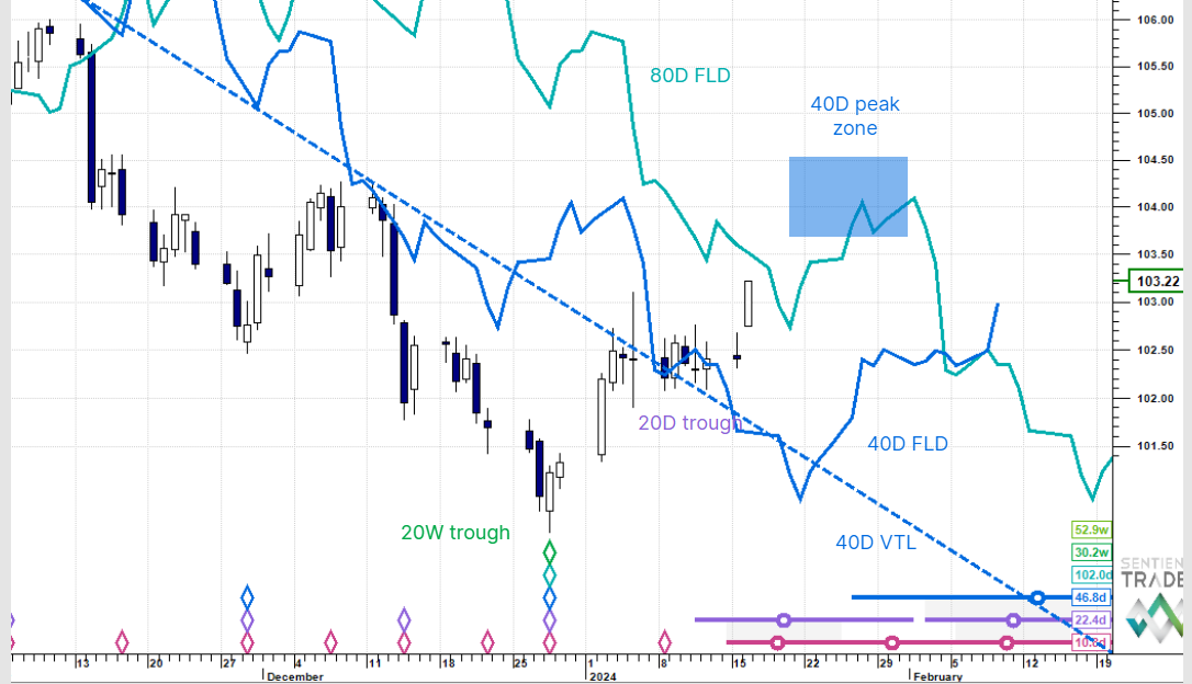
I explained that it seemed likely that it was, and would be confirmed if price dropped below the 40-day FLD. Here is what happened:

The orange line is median price and it did indeed drop below the 40-day FLD, thereby confirming the peak on Tuesday 20 September as the peak price of the current 40-day cycle.
However I mentioned last week that strict adherence to cyclic principles is not always rewarded by the market. Phasing analysis is as much an art as it is a science, and there are times at which one should exercise some artistic license. This is one of those times, because as can be clearly seen, the market is trapped in an increasingly complicated FLD Pause Zone (the FLD’s are all getting very mixed up with one another). Pause Zones are dangerous areas where one needs to evaluate carefully what is happening.

Here are the projection boxes showing the peak occurring slightly earlier and lower than expected, but definitely within the box. Price is now moving down towards the trough expected mid October somewhere about the 1065 level (bumping out of 20-day and 10-day cycle troughs on the way). The analysis certainly seems viable, but as we are in a Pause Zone, let’s see if we can find a better analysis which might be clearer in the short term.

Positively identifying troughs when caught up in a Pause Zone is tricky, and so here is another option (although less likely in my opinion). Here the 40-day trough is not placed on 12 September 2011, but was possibly formed 11 days later on 23 September 2011. That would make the previous 40-day cycle 45 days long, which is not impossible, but the perfectly nominal 34-day length still seems more likely. However let’s pursue this analysis, and see if we can learn anything from it.
The red-filled projection box tells us that there is some potential for further upward movement, but not much time left for it to happen, and price has already entered the box, indicating that it might all be over, after which price is expected to fall towards the next 40-day trough (and synchronous 80-day cycle trough), expected mid-to-late October.
And so effectively this possible alternate analysis is giving us the same message: we are expecting price to emerge from the Pause Zone to the downside, and fall to a trough in the second or third week of October. Beware of a pop up (as per the second analysis), but short entry levels could be placed to catch the fall out of the Pause Zone.
This final chart shows a gap to the downside in the 40-day and 80-day FLD’s which the market might jump into, thus breaking free of the Pause Zone:

But that is pure conjecture, and one should always be careful of seeing patterns before they are formed, but nevertheless an interesting chart!